Aims
Finish Practical
Achieved
The practical element is largely finished and has been tested. The essay is almost completed and just needs feedback which I will receive next week.

Friday, 30 December 2016
Friday, 23 December 2016
timeplan / week 12
Aims
The aims of this week were to finish the essay
Achieved
Unfortunately the essay isn't completed yet. I still have to write the conclusion and parts of chapter 4 and I would like some feedback before it gets printed. This means next week I may have to focus on the essay more than the practical as the essay can be discussed in my final tutorial.
Friday, 16 December 2016
timeplan / week 11
Aims
Begin chapter 3
Achieved
This week I worked on my essay. I decided that it was better to change the structure and include a 4th chapter that will discuss gender neutral design, and have the 3rd chapter to discuss gendered design. I am on track to finish in time if I keep to the timeplan!
Begin chapter 3
Achieved
This week I worked on my essay. I decided that it was better to change the structure and include a 4th chapter that will discuss gender neutral design, and have the 3rd chapter to discuss gendered design. I am on track to finish in time if I keep to the timeplan!
Thursday, 15 December 2016
essay / new structure
With the change of the essay question, continuing on with the same structure started to become less of a good idea. The current structure in place is 3 chapters:
Chapter 1 - Gender Development
Chapter 2 - Colour theory, primary research, childrens gendered brands
Chapter 3 - Brand theory and Gender neutral brands
This structure seemed too messy and not thought through enough for my new question. I decided to change the structure and add in an additional chapter to give each aspect of the dissertation room to be discussed properly. Chapter 1 and 2 largely remain the same, though some aspects of chapter 2 are moved to a new chapter all together.
Chapter 1 - Gender Development
Chapter 2 - Colour theory, Primary research
Chapter 3 - Brand theory, Gendered Children's brands
Chapter 4 - Gender neutral brands and techniques from professional designers.
Chapter 1 - Gender Development
Chapter 2 - Colour theory, primary research, childrens gendered brands
Chapter 3 - Brand theory and Gender neutral brands
This structure seemed too messy and not thought through enough for my new question. I decided to change the structure and add in an additional chapter to give each aspect of the dissertation room to be discussed properly. Chapter 1 and 2 largely remain the same, though some aspects of chapter 2 are moved to a new chapter all together.
Chapter 1 - Gender Development
Chapter 2 - Colour theory, Primary research
Chapter 3 - Brand theory, Gendered Children's brands
Chapter 4 - Gender neutral brands and techniques from professional designers.
Friday, 9 December 2016
timeplan / week 10
Aims
Attend practical crit
Achieved
This week I have tried to get the majority of my practical completed before the crit. The practical crit was beneficial as minor details were pointed out that I wouldn't have thought of myself. I also received feedback on my practical from children and their teacher which was good as I am able to make changes before the final design is printed.
Thursday, 8 December 2016
practical / crit and feedback
8th December crit:
The preliminary magazine was taken into the CoP practical crit. The magazine features 44 pages of content for the children which is shown below:
The feedback was largely positive with just a few notes on the general design. It could feature a barcode on the back with a price. It was also noted that the back of the magazine should have the same border/background colour as the front page, and the illustration of Pear waving should be on the inside. I asked whether page numbers should be included but everyone decided they weren't needed overall.
I also asked opinions on the final stock choices as this version was printed on regular printer paper. Suggestions were thin, quite shiny stock that is used in most children's magazines, though I am unsure about this as it wouldn't be very hardy or suitable for the colouring pages. The feedback on the staple bind was positive as it's the most suitable for this type of publication. Some people had issues with the blank page before the "letter of the month" page, which had been included to separate and introduce the feature as it will be appearing in all of the issues, and to ensure a double page spread was there afterwards to make room for the illustrations. Suggestions to fill in this page could be a pattern or other illustration which links to the letter.
Feedback from children and teachers:
The booklet was also taken into the school and given to teachers and students to look through and give feedback on the content and suitability of the design. As the teachers and students are not normally concerned with graphic design, their feedback was quite limited but still extremely valuable.

Teacher feedback:
Lovely, bold neutral colours. Fab activities for children to complete. Children would be able to complete activities with parents. I really like the names of the fruit and the catchy names of the activities such as 'pear necessitates'. I like how it covers a range of skills, such as lit, num & topic. Really well done, I'm well impressed with this, I cannot believe you have made it, its fabulous! I would love to do this with my class.
Children feedback:
Overall both sets of feedback was very useful. The feedback from the school was all very positive, with little criticism to build on. This in itself is quite positive as it means the content of the magazine is suitable for the audience. A lot of the children commented on the activities in the magazine rather than the actual design, but it was not expected of them to be critical or offer constructive feedback. The next stage for the project is to make revisions to the magazine, then test it alongside existing publications to see whether it is successful when gendered publications are available.
The preliminary magazine was taken into the CoP practical crit. The magazine features 44 pages of content for the children which is shown below:
The feedback was largely positive with just a few notes on the general design. It could feature a barcode on the back with a price. It was also noted that the back of the magazine should have the same border/background colour as the front page, and the illustration of Pear waving should be on the inside. I asked whether page numbers should be included but everyone decided they weren't needed overall.
I also asked opinions on the final stock choices as this version was printed on regular printer paper. Suggestions were thin, quite shiny stock that is used in most children's magazines, though I am unsure about this as it wouldn't be very hardy or suitable for the colouring pages. The feedback on the staple bind was positive as it's the most suitable for this type of publication. Some people had issues with the blank page before the "letter of the month" page, which had been included to separate and introduce the feature as it will be appearing in all of the issues, and to ensure a double page spread was there afterwards to make room for the illustrations. Suggestions to fill in this page could be a pattern or other illustration which links to the letter.
Feedback from children and teachers:
The booklet was also taken into the school and given to teachers and students to look through and give feedback on the content and suitability of the design. As the teachers and students are not normally concerned with graphic design, their feedback was quite limited but still extremely valuable.

Teacher feedback:
Lovely, bold neutral colours. Fab activities for children to complete. Children would be able to complete activities with parents. I really like the names of the fruit and the catchy names of the activities such as 'pear necessitates'. I like how it covers a range of skills, such as lit, num & topic. Really well done, I'm well impressed with this, I cannot believe you have made it, its fabulous! I would love to do this with my class.
Children feedback:
 |
| Girl Aged 5 - Liked the pictures and the colours. |
 |
| Boy Aged 5 - Liked the puzzle. |
 |
| Girl Aged 5 - Can colour in. Boy Aged 6 - Can colour in the picture. Girl Aged 5 - Can colour in the watermelon. |
 |
| Girl Aged 6 - Liked the picture and can cut out. |
 |
| Girl Aged 5 - Like doing numbers and it has favourite fruit - strawberry and watermelon. Boy Aged 5 - Has numbers and can colour the worm. |
Overall both sets of feedback was very useful. The feedback from the school was all very positive, with little criticism to build on. This in itself is quite positive as it means the content of the magazine is suitable for the audience. A lot of the children commented on the activities in the magazine rather than the actual design, but it was not expected of them to be critical or offer constructive feedback. The next stage for the project is to make revisions to the magazine, then test it alongside existing publications to see whether it is successful when gendered publications are available.
Wednesday, 7 December 2016
practical / content
The content of the magazine is obviously important, but for the purpose of this brief it doesn't have to be as highly considered as the design and colour scheme. That being said, the content for a children's magazine aimed at 3-5 years needs to be suitable for their skill level.
The type needs to be large and easily readable with short amounts of text. There will be an educational aspect to the magazine, so the content needs to be suitable to their level. Some of the text included in the magazine will be quite lengthy i.e. instructions for games. As some children have different reading skills, parents may have to assist with reading the instructions.
Overall, the magazine needs to be fun and stick to the theme of making friends. There will be pages that introduce characters and invite children to talk about their own friends, games and puzzles for them to complete!
Examples of the content are shown below:
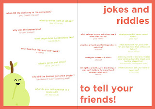


Tuesday, 6 December 2016
practical / character design
As the first issue of the magazine is about making friends, it seemed suitable to create a few characters that were Pear's friends who can feature throughout the magazine.
4 characters in total seemed suitable, so 3 new ones were designed to give the magazine more depth. Each character is presented as genderless, though they each have different personalities and appearances which reflect other children in real life.
4 characters in total seemed suitable, so 3 new ones were designed to give the magazine more depth. Each character is presented as genderless, though they each have different personalities and appearances which reflect other children in real life.
 |
| Melly the watermelon |
 |
| Segmund the orange |
 |
| Berry the strawberry |
 |
| The friends together look similar in design and friendly. |
Monday, 5 December 2016
practical / cover design
The cover of the magazine has to grab the attention of parents and children. It must stand out on the shelf and look appealing to all.
The colour scheme for the magazine allowed for either a pale yellow, orange or red background due to the pear being green. The magazine will be themed each issue, and as the purpose of the magazine is to be gender neutral and inclusive, the first issue will be about making friends! The type choice is Gotham Book, as it is simple and easy to read for children. It is bold and stands out on the page. It is also quite similar to the more popular choice of typefaces chosen by the children in the primary research - impact and comic sans.


The colour scheme for the magazine allowed for either a pale yellow, orange or red background due to the pear being green. The magazine will be themed each issue, and as the purpose of the magazine is to be gender neutral and inclusive, the first issue will be about making friends! The type choice is Gotham Book, as it is simple and easy to read for children. It is bold and stands out on the page. It is also quite similar to the more popular choice of typefaces chosen by the children in the primary research - impact and comic sans.


These designs were given in an informal crit and feedback was given on the designs. The orange cover was the most popular as it is more likely to stand out on the shelf. The group also preferred 'pear' magazine, though they thought the tagline could be changed to 'young minds'.
Given the feedback, the cover was altered and a 'sticker' effect was added as it was also pointed out that children often go for magazines with free incentives.

practical / initial ideas
Before creation of the publication, I first needed to think of a name, colour scheme, typefaces and entire brand image.


 |
| Name mind map |
I considered quite a few different themes when coming up with a name. The general theme had to be gender neutral and also educational to fit with the demographic. Some themes included animals, which is what Illustrator Chris Haughton recommended using to allow the children to identify with the characters, though most of the names of baby animals didn't really fit with an educational magazine. Another aspect would be fruits, which gives a scope for character creation and would be easy to create as fruits don't have faces (lots of room to play around with expressions and features). This also fits with the gender neutral theme and allows children to identify with the characters. Lots of different fruit characters could be created to show the differences between other people, yet keeping them open enough that anyone could identify and connect with them.
The names of the fruit for the magazine on the mind map are "berry", "grape", "pear", and "nana's" (short for bananas). The most suited name here would be Pear, as it is simple and could also be related to the word "pair", associated with 2 (as the magazine is aimed at both boys and girls).
Once the name was decided, the magazine needed an identity. I decided to start experimenting with the front cover to get a feel for the type choices and colour scheme. My first thought was to have an actual pear incorporated within the logotype.

The soft colours relate to the audience and let the parents know that it's a product for young children. The typeface is very simple and easily read. The pear that replaces the 'a' is also very simple, but as a whole I felt that something wasn't working. It wasn't obvious enough that the word was supposed to read 'pear'.
I moved onto creating a separate image and logotype which could both be used together or in different contexts.


Keeping the soft greens and off whites, this logo worked better for me, though I began to think about what it would actually be used for. The magazine doesn't necessarily need a logo, but a striking identity and an easily recognisable layout/colour scheme for the front cover.
I moved onto deciding on a colour scheme. I wanted to keep a fresh feel as the theme is fruits, so some reds and oranges also feature in the desired scheme. As discussed in previous research, colours are only gendered when they are placed in certain contexts, so additions of dark pinkish red would not compromise the gender neutrality of the magazine unless placed in a context that is inherently 'girly'.
 |
| Proposed colour scheme |
This colour scheme allows different colours of fruits to be used while still keeping with the core concept of the magazine.
Moving away from a logo, I thought it would be better to create a memorable character that can be associated with the magazine instead. As the magazine is called Pear, the main character should obviously be a pear too! This character can feature in all issues of the magazine guiding the reader through the content, creating a fun personality for them to engage with and enjoy.

The first Pear design used the template of the original logo with the thick stem and transparent leaf. Only one colour was used in this design, though it was pointed out that it looked a bit lifeless and could benefit from some extra colour.

The next development of Pear was adding a brown stem, changing the eyes to black and the addition of orange from the colour scheme. This was heading in the right direction, but feedback from this version was that the stem was too thick and the colours seemed slightly out of place.

The final design of Pear gives them a thinner stem and full leaves. Contrasting facial features that stand out and don't clash with any of the other design or could impact on the rest of the colours used.
Sunday, 4 December 2016
practical / existing publications
Before starting to design my own publication, it was essential to discover what was already available to children and what stood out on the shelf.


Looking in WH Smiths, you can see the contrast between the boys section and the girls section. There is a lot of yellow and green on the left, and lots of pink on the right. There doesn't seem to be any magazine that stands out as everything is competing with each other.

Anorak magazine was found in Village Bookstore, an independent shop that sells a wide variety publications. It appears that magazines like this (gender neutral/well designed) are hidden away in smaller shops and are not as popular. This could be due to many factors - parents not wanting to pay for a more expensive magazine, children want their 'own' magazine that appears to be designed for them (gender stereotypes), or that companies simply won't stock the magazine due to low demand (albeit there isn't much choice on the shelf for gender neutral design anyway).
Dot magazine is created by the same company as Anorak, appealing to the under 5's. This magazine is rarely found on the shelf and can mostly only be ordered online.

practical / audience considerations
The audience of this magazine is quite specific, but also needs a lot of consideration as there are many restricting factors of the brief.
The Children
The children that the magazine is aimed at will be between 3 and 5 years old. The magazine will be aimed at both boys and girls, so gender stereotypes should be avoided within the design. As the children are quite young, some content might not be suitable for the youngest as it requires reading, but such activities can be completed with the help of parents. The type face choices need to be suitable for young readers, so they should be legible and easy to read. A friendly approach could be to use all lower-case letters within the magazine on headings. The colours also need to be considered, as this factor is the most stereotyped within gender. Pinks and blues can still be used, but not in a context that is considered 'gendered'.
The Parents
The parents will be the ones who buys the magazine, so it is important to consider their requirements too. For parents, the magazine needs to look friendly, fun and appealing. The magazine will have an educational factor too, so this should be displayed on the cover to grab their attention.
Saturday, 3 December 2016
practical / primary research / results
A preliminary experiment took place to see what children preferred when dealing with the front cover of a small publication. The differences between the covers were colour and typeface choices. These were also carried out through the inside of the publication but to a lesser degree.

The results were gathered from 34 children with a range of ages and genders.

Boys: Yellow = 5, Pink = 3, Blue = 10
Girls: Yellow = 2, Pink = 11, Blue = 2
Overall: Yellow = 7, Pink = 14, Blue = 12
Pink and blue were definitely the most popular between the children. 47.6% chose pink overall, 40.8% chose blue overall, and 11.6% chose yellow.
These results were to be expected, as they correspond correctly with the previous research where children were asked about their favourite colours. It seems as though colour has a large impact on the children. Boys are more likely to go for something more neutral, whereas girls largely prefer pink.
Friday, 2 December 2016
timeplan / week 9
Aims
Attend tutorial 4
Achieved
This week has been extremely busy in terms of practical and primary research. I have got back 70 answers from the primary school and decided on a brief for my practical. I have also gained responses from professional designers regarding gender neutral design. Tutorial 4 was also beneficial as I have decided to change my essay question. This makes it more succinct and easier to answer/test.
practical / professional designers
To get an insight into what skills and techniques were used within gender neutral design, I decided to contact some professional designers who have already created some designs for a gender neutral demographic. I emailed roughly 10 designers/companies and 3 managed to get back to me.
Chris Haughton
Christ Haughton is an illustrator with a range of children's books. He uses animals as the main characters within his books and a wide range of soft colours. I asked him about his thought process when creating his books, and whether he considers gender neutrality within his design or if it's just his style. Examples of his work are shown below:


"i try to keep characters genderless when possible.


I definitely do think that certain colors have specific gendered connotations in certain contexts. In fact, I would say that certain colors have specific gendered connotations in MOST contexts. I think this is especially saddening when it comes to kids, because from an early age they are taught that they have to like or dislike a specific color or dress in a specific way simply because of their gender.
I think gender neutral children's brands become successful when they don’t try to strip personality out. I’ve seen a lot of gender neutral brands that take a very simplistic approach and only use white & black. This can work in specific situations, but don’t feel that direction works for kids. I don’t think that just because a brand wants to appeal to both genders means that they need to be ultra sensitive and strip out every single element that alludes to “boy” or “girl.” We’re all still humans, so I think the most successful gender neutral brands take that fact and run with it."
Chris Haughton
Christ Haughton is an illustrator with a range of children's books. He uses animals as the main characters within his books and a wide range of soft colours. I asked him about his thought process when creating his books, and whether he considers gender neutrality within his design or if it's just his style. Examples of his work are shown below:


"i try to keep characters genderless when possible.
just because its unnecessary! the reader is less likely to identify with the main character so much if they are ‘other’ in any way. that is also why i think using animals is better than human characters. we tend to identify more with animal characters because with human characters we only see the character's differences. strangely i would be more likely to ‘see’ myself in an owl sooner than a blonde haired boy or a brown haired girl, any details that differentiate the reader from the main character are not helpful. for some reason placing the main character as an animal allows poetic licence.
i would never make a specifically ‘girly’ or ‘boy’ book. i would like to try to have the stories be universal. and ideally be able to be understood and enjoyed by anyone from the youngest children, less than1 year old to the most educated of adults from any culture and everyone in between. i try to steer away from using gendered colours too. the gendered colours are just a cultural thing for this part of the world at this time so i think they detract and date too."
Mayra Magalhaes
Mayra created a design for a new elementary school. I asked her how she created a design that welcomes all children, and whether she considered gender neutrality within her design. I also wanted to get her take on what she thinks make gender neutral brands successful. The branding for the school is shown below:


"Do you think certain colours have specific 'gendered' connotations in certain contexts?
The link between specific colors and genders is something recent in our history. It began in the early 20th century.
The funny thing is: at that time, pink was considered more appropriate for boys and blue for girls. This all started to change around the 1940s, when pink started being recommended for girls and blue for boys. Weird, huh? But this change was widely adopted by all kinds of industries targeting kids. It's everywhere. What a boring, monochromatic world these industries built for each gender.
Did you consider gender neutrality within your design for the school?
I try to avoid the colors cliché and bring more diversity to my projects whenever I have a chance. So yes, I considered gender neutrality within my design for the school.
If so, what techniques did you use to achieve this?
In order to do that, I used some colors that are not used very often for this target audience. They are mostly tertiary colors, not related to a specific gender. At the same time, they compose a bright and fun color palette, which is great to catch kids' attention.
Keeping in mind that both girls and boys enjoy fantasy related stuff, I also used a whimsical illustration style.
How do you think gender neutral children's brands become successful?
Nowadays, if brands just copy whatever everyone else is doing, they will blend in - which is bad if they're trying to get more attention.
Besides that, we live in a world with an increasingly gender neutrality and equality. That's not just a trend. It's something that's here to stay. If these brands don't adapt to the reality, they won't survive for a long time.
Even some of the most established brands realized this and are trying to avoid the gender clichés. Mattel, for example, is using different colors and including boys in their Barbie dolls campaign. "
Anna Rising
Anna created a brand for children that encourages nail painting for both boys and girls. The brand is called Kanvas and has an emphasis on creativity and expression. I asked her what techniques she used to achieve a gender neutral brand, and what it takes to be successful in a competitive market.


"When branding Kanvas, my main objective was to focus on the product’s core idea: self-expression. Kanvas’ main product is nail polish and when it comes down to it, nail polish is literally just paint for your body. It didn’t make any sense to me why putting color on your nails suddenly made you girly. I wanted Kanvas to celebrate color, self-expression, creativity and fun directly in it’s branding and packaging. To do so, I used bright colors and a fun paint splat-like pattern. I aimed to use all kinds of colors - pinks, blues, reds, greens - so the product didn’t weigh specifically toward one end of the spectrum. The abstract shapes in my pattern also helped me avoid imagery that has connotations for specific genders.
I definitely do think that certain colors have specific gendered connotations in certain contexts. In fact, I would say that certain colors have specific gendered connotations in MOST contexts. I think this is especially saddening when it comes to kids, because from an early age they are taught that they have to like or dislike a specific color or dress in a specific way simply because of their gender.
I think gender neutral children's brands become successful when they don’t try to strip personality out. I’ve seen a lot of gender neutral brands that take a very simplistic approach and only use white & black. This can work in specific situations, but don’t feel that direction works for kids. I don’t think that just because a brand wants to appeal to both genders means that they need to be ultra sensitive and strip out every single element that alludes to “boy” or “girl.” We’re all still humans, so I think the most successful gender neutral brands take that fact and run with it."
Analysis
The main factor that all three designers stated was important for neutrality was colour. It appears as though colour is what separates a design from gendered or gender neutral, with other considerations being less important. A critical point raised by Anna is that the design shouldn't lack personality. All the designs featured here are very fun and exciting, not dull or stripped back, which definitely adds to their success.
Overall, I have learnt that the designs need to have a colour palette that is well considered, something that both boys and girls can identify with, and a design that has a fun tone of voice and lots of personality!
practical / the brief
Background
It is apparent that children’s brands, inherently publications are designed to appeal to either boys or girls using the same recycled techniques that come from gender stereotyping. Children are very impressionable and many young children abide by the rules set out by design; that if something is pink, it’s for girls and if something is blue it is for boys.
Brief
Create a gender inclusive publication for 3-5 year olds which is attractive to all genders. The publication should be educational and fun, but the most important aspect is the appeal. It should not be hindered by its design and gender inclusivity, but should be propelled above other designs that could be considered gendered. The aim of the brief is to find out whether gender neutral design can be appealing within the midst of stereotypical gendered publications.
Considerations
- What are the techniques used to appeal to both boys and girls?
- Will parents want to pick up this magazine?
- Stock and binding choices as children can be quite heavy handed
- Does the magazine have longevity? Think about future issues and how the brand is presented
Deliverables
Print, produce and photograph a new children’s publication. Create brand guidelines for the publication to showcase your knowledge of gender neutral techniques. A 500 word evaluation and design boards should be completed and submitted.
Thursday, 1 December 2016
tutorial 4
This tutorial was heavily focussed on the practical element. The feedback on my idea so far was positive but it still needs to be thought through some more.
Practical
The current idea is to conduct primary research to see what children will be most drawn to - a pink, blue or yellow booklet. The general hypothesis is that the most popular will be the gendered approach (pink and blue), in which case it could be suitable to continue the practical with a more inclusive and gender neutral design which appeals to both boys and girls. A new activity book will be designed with techniques in mind that will be appropriate to boys and girls, rather than having extreme stereotypically gendered designs. The new design should be discussed within a focus group to see whether it is successful and appealing.
Essay
The essay feedback was good, though I thought about how the practical element was progressing and how the essay question was quite difficult to answer in general. The current question is:
"Does graphic design influence children's perception of gender?"
It was discussed that this question is very hard to prove in the limited time and methods available to me, and doesn't have much synergy with the practical element. Instead, I thought about this question:
"Does graphic design for children need to be gendered to be successful?"
This question creates room for an exploration of brands and other elements of graphic design specifically related to gender. As the practical element is based around publications a focus in the essay should also be on children's literature - a large part of chapter 3 will be dedicated to this.

Tuesday, 29 November 2016
practical / primary research / booklets
To gain a better understanding of the way children decide on a product its essential to conduct primary research. The research is based around what colours and typefaces children prefer. Children will be presented with a choice of three booklets with different cover designs - the only variables on the cover will be the colours and typeface choices.


The neutral option is the yellow booklet. This book needs to still stand out to the children between the pink and blue, so it was created with a bright background. The blue booklet is stereotypically aimed at boys with a dark blue background and sturdy typeface. The pink booklet is stereotypically aimed at girls with a more delicate typeface and pastel colours.
The research will determine which approach is most popular for children based on the cover of the booklets.

Monday, 28 November 2016
practical / plan
The practical element of the project will aim to discover whether graphic design for children needs to be gendered to be successful. As discovered in the primary research conducted for the essay, pink and blue still dominate between boys and girls as their favourite colour in general.
A preliminary investigation will take place to generate further evidence of the popularity of pink and blue, though a third choice will be given to the children. This aims to see whether when presented with another option, children will still choose their gender-specific colours. The research will take place in observational form. The children will be given a choice of three small booklets and their reactions will be observed.
The variables in the preliminary booklet are the colour and typeface choices. The content of the booklet is the same for each.
The most popular approach will be noted and a final design will be produced taking techniques (colours, typeface) from either the gendered, or ungendered booklet. A new children's brand will be created featuring logo, brand guidelines and a range of products.
Sunday, 27 November 2016
primary research / results
The primary research undertaken was a sample of 29 girls and 41 boys. The results from the research are presented in the following graphs.
1. What is your favourite colour?

2. Do you prefer pink or blue?

3. Which typeface do you prefer?


Conclusions:
1. What is your favourite colour?

2. Do you prefer pink or blue?

3. Which typeface do you prefer?


5. Which picture do you like the best?


6. Which picture do you like the best?


Conclusions:
- Pink and blue dominate between boys and girls even when other colours are available.
- Boys like blue and girls like pink.
- There was a larger range of colours between the boys than the girls.
- Girls prefer brighter, lighter colours. Boys prefer darker colours.
- Impact was the most popular typeface between both boys and girls, though was the clear winner for the boys. Comic Sans and Apple chancery were joint 2nd for the girls, showing they can be more flexible on the typeface choice.
- Children preferred the cartoon style image of their own gender. Very few chose the opposite gender. They associate with their own gender the most.
- Between the boys, the most popular magazine was Kick, but Okido came a close 2nd. This could be because of the use of blue. Kick could have been most popular due the busy layout and dynamic typography.
- Between the girls, Storytime was the clear winner. The delicate typeface and use of pink, nature and animals could have persuaded them.
Subscribe to:
Comments (Atom)